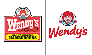
Wendy's pigtails are about to get an upgrade.
For the first time since 1983, the Dublin, Ohio-based fast food company is updating its logo in a move intended to signal its ongoing transformation into a higher-end hamburger chain.
Instead of the boxy, old-fashioned lettering against a red-and-yellow backdrop, the pared down new look features the chain's name in a casual red font against a clean white backdrop. An image of the smiling, cartoon girl in red pigtails floats above — though this girl looks more vivid and not quite as childlike.
In an interview with The Associated Press, CEO Emil Brolick said the current logo had served the company well for the past three decades, but that it was time for an update. Still, Brolick said he was encouraged by consumer feedback in testing dozens of new logo variations over the past several months.
"When we pushed things too far. They very much reeled us back," he said, noting that it showed just how attached people are to the brand.
It's only the fifth logo update since founder Dave Thomas opened the first Wendy's in 1969, and perhaps the most significant. The makeover comes as the chain known for its square burgers and chocolate Frosty shakes struggles to redefine itself in the face of intensifying competition from the likes of Panera Bread Co. and Chipotle Mexican Grill Inc., which are seen as a step up from traditional fast food.
Wendy's push has intensified since Brolick came on as CEO about a year ago. In addition to raising perceptions about its food, Brolick is focusing on renovating outdated restaurants with a look that features natural lighting, flat-screen TVs and a variety of seating options, including cushy chairs in nooks.
The idea is to create a more inviting atmosphere where consumers feel they can relax. Starting in March, Wendy's says the updated logo will start appearing on newly built and renovated restaurants.


No comments:
Post a Comment